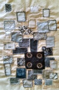
Yes, I am still here! What happened to me since my last post? Well, things like chocolate chip cookies, writing poetry, planting seeds, fresh baked bread, spring flowers, bird watching and so on. Of course, I have been stitching too, though my color and design project is definitely going to be a two year endeavor. Other than the neutral palette pieces that I have previously introduced, I have pieces started for the second workshop (monochrome) and the third workshop (complementary color). Additionally, I have selected fabric for no less than six collages dealing with the fourth workshop, complex complements. I’m getting back on track with posting once a week here, so please check back for profiles of my continuing color adventures. I will discuss the monochrome workshop next week. Meanwhile, here is a picture of one of my neutral palette collages with some stitching:

The first workshop also incorporates an investigation of balance as it relates to art design. This is the example for radial balance, where the design emerges from a main focal point. This particular collage also uses informal or asymmetrical balance, even though I have another collage for that type of balance. I am finding that some pieces of art straddle more than one category of certain design elements. In these cases, a piece of art will usually be a better representative of one category more than another. When I finish my intended sample of informal balance, I will post it alongside this radial balance piece, and I’ll compare and contrast the two.
Until next week, I will keep stitching, and searching for the ultimate chocolate chip cookie.

